You may already know that email is a tried and tested way to drive revenue to your visitor attraction.
What you may not know is that small changes to your email creative can make a big difference to your campaign performance.
So, to make a bigger splash with your next email campaign, ensure your creative team gives consideration to the following 5 creative tips...
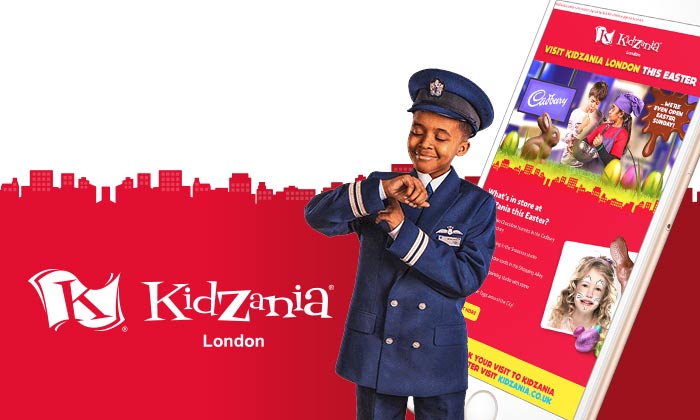
According to Litmus, mobile devices now account for 54% of all email opens. The way consumers engage with email has changed fundamentally over the last few years so sending an email campaign designed for mobile use will improve the user experience for over half of your customers. A better UX leads to more booking and more visitors.
Your creative partner should demonstrate how your email works on mobile devices as part of the design process.

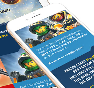
A well crafted animated GIF can have a huge influence on user engagement. According to Experian, 72% of clients who made use of animation observed higher transaction-to-click rates. Though be careful - only use animation where it is appropriate to your campaign content and not just for the sake of it.
Rich and lengthy animations can bloat an email, leading to delivery problems, a negative user experience on slower connections and ultimately less visitors to your attraction.

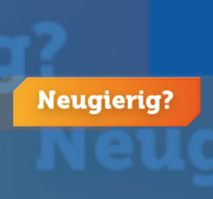
Don't just settle for standard images, text and buttons. When it comes to email design in 2018 you have a host of interactive options, including scratch & flip, dropdown menus, carousels and accordions. Just because some features only work on the latest email clients shouldn't put you off, especially when you consider the engagement levels from point 1.
Your creative partner should demonstrate that backups are in place to provide a good User Experience across older email clients.
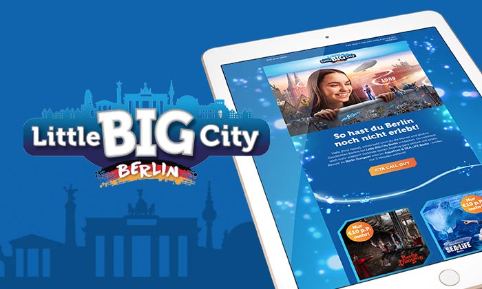
More choices often leave users spoilt for choice and can cause fewer conversions. It is proven that limiting your email to just 1 or 2 CTA's can cause a dramatic improvement to click-through rates. According to Marketing Sherpa , Whirlpool got a 42% CTR increase by bringing down the number of CTAs in its emails from 4 to 1.
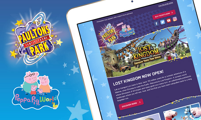
Ensure your CTA appears 'above the fold' on the ma jority of devices. Don't rely on your users having to scroll down to find your BOOK TICKETS button.
According to a recent study - up to 40% of recipients on your mailing list won't see any images by default. Email clients frequently block images which means designing a backup plan is really important. This is where Alt tags come in. Setting alternative descriptive text to display in place of every image ensures your emails are legible and actionable, especially when images aren't displayed.
© All Interactive Ltd | studio@allinteractive.co.uk | 01256 578 014
DeskLodge, Belvedere House, Basing View, Basingstoke, RG21 4HG